
Home

Posts

About

Contact
Recent Posts

We can learn so much from Dolce & Gabbana about how to design clothes and create a brand. But probably the best lesson we can learn from Dolce & Gabbana is how not to file an application for a design registration. The truth is that they're particularly awful at design registrations. Here are a few top tips, courtesy of D&G:
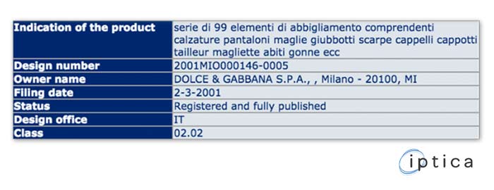
It's tempting to stuff all your designs into one application. But, for a design application to be valid, it's better to limit the number of items per design application to 1. Some countries permit a design application to cover a "set of articles". However, each item in the set requires a common design element (e.g. a set of cutlery or crockery). Relying on a common D&G label is … well, a bit of a stretch.
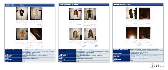
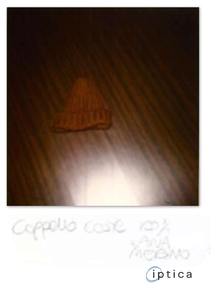
Designs should show the product. Light is useful. Just because it's evening wear doesn't mean that the photo must be taken at night, without flash.
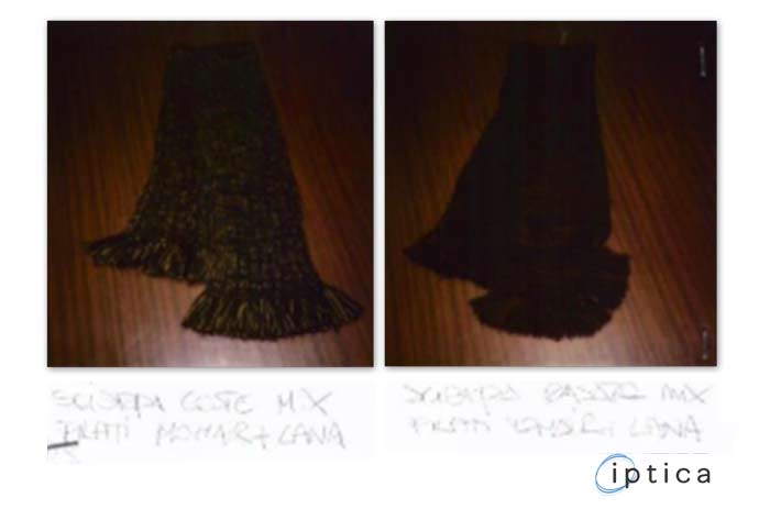
Dolce & Gabbana's bed sheet is not the worst attempt at a neutral background I've seen, but a melamine‐wood background for a wood‐brown hat lacks contrast; contrast is good.
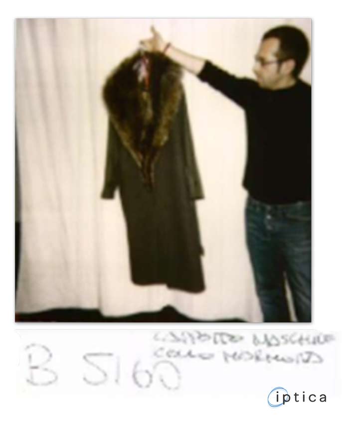
To be honest, the hanging arm is not Dolce & Gabbana at their best. Especially when Mr Dolce enters the frame ‐ it becomes somewhat unclear whether the design is protecting the hanging coat, or Dolce's black top and jeans. Kind of reminds me of my school report cards: "Has potential. Can do better".
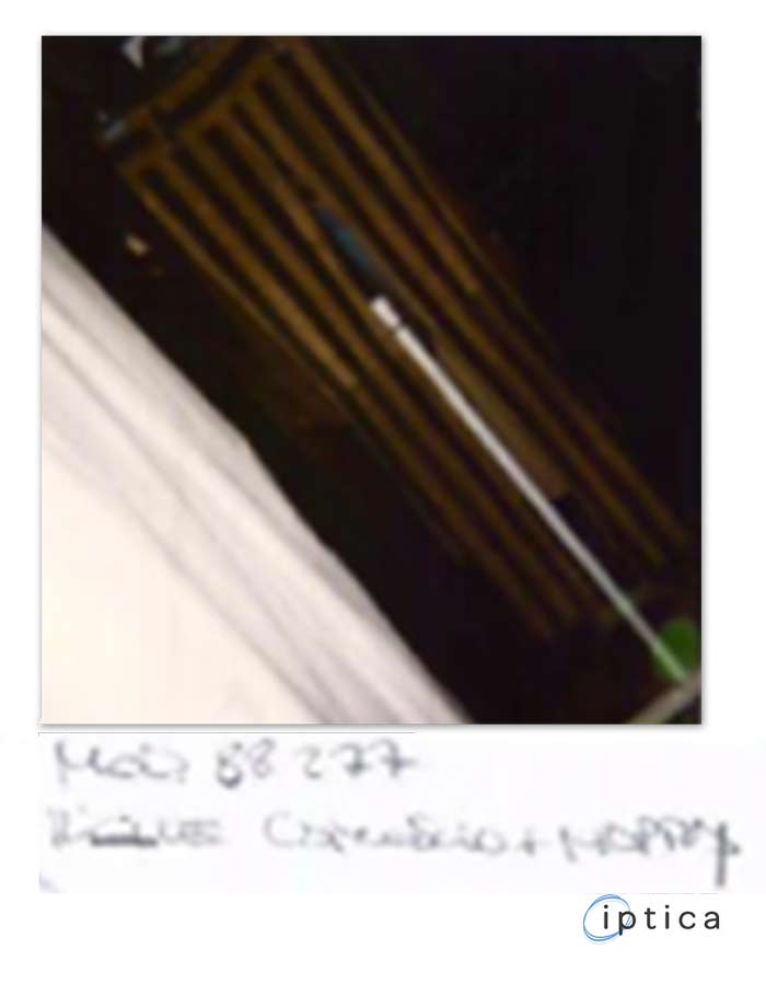
Never mind the slight lack of contrast. Don't break the golden rule: if the pants are too long for a portrait picture, zoom out or stand back. Only when your back is pressed against the wall should you consider tilting the camera to increase the portion of pants captured in the photo from 70% to 93%. 93% is better, but it's still not 100%. 100% is great.
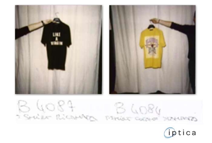
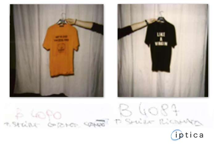
If the cameraman can't read the writing on the T‐shirt, it's likely that the photo will come out a little blurred. If the aim is to protect the message on the shirt, that's not good.
Like our page on facebook: